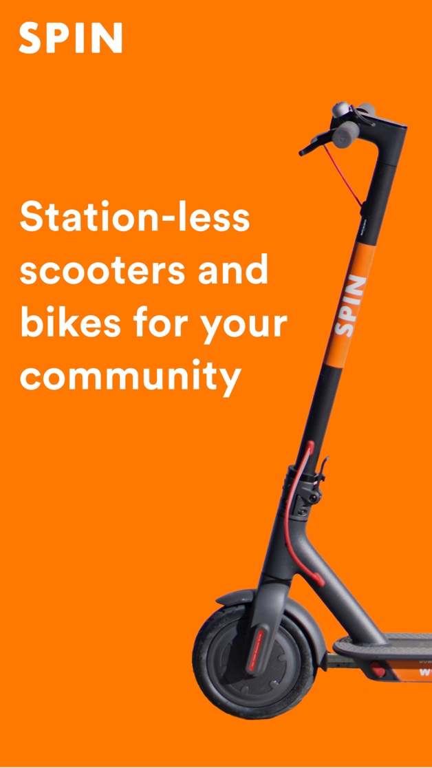
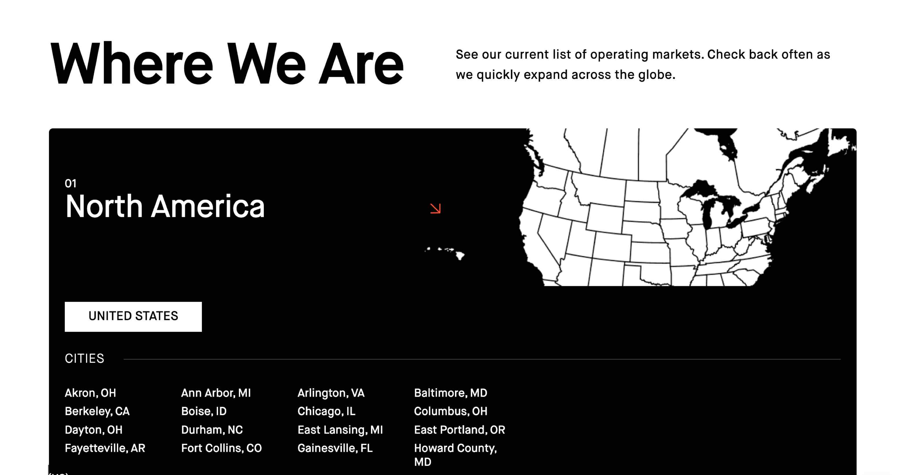
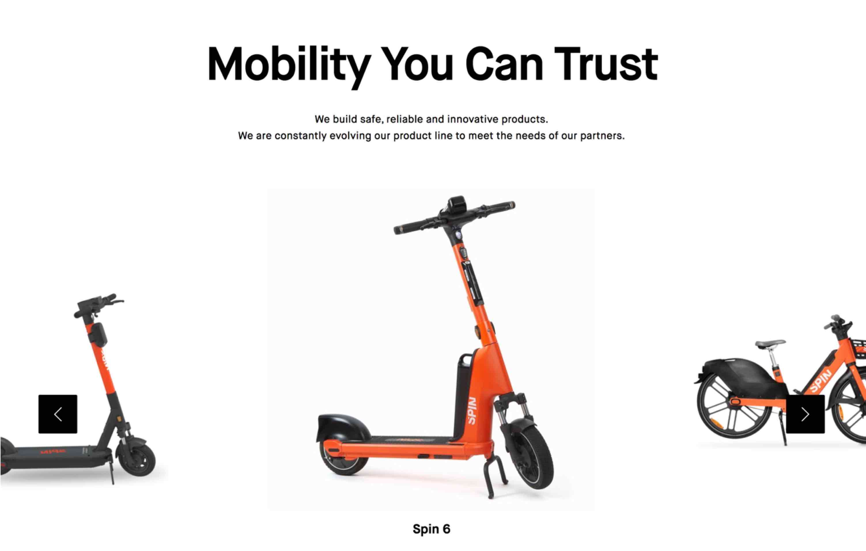
Bold typography, crisp imagery, and intuitive design guide users through a journey of discovering how Spin is revolutionizing transportation. Whether you're a rider, a partner, or a city planner, this site offers all the tools you need to connect with Spin’s vision for a greener, more connected world.


Scooter App needed a site that could clearly introduce a new product while still feeling confident, modern, and credible from day one. The experience had to explain what the app does without overwhelming users—and do it in a way that felt distinctly them, not like a generic app landing page.
The challenge was translating a growing product vision into a digital experience that felt both focused and flexible.

We treated the site as an extension of the product itself. Every section was designed to guide users through Scooter App’s value proposition, answer questions quickly, and create momentum toward action.
Rather than over-designing, we focused on strong hierarchy, intentional pacing, and a modular layout system—allowing the site to evolve naturally as the product grows. The goal was clarity first, polish second, and flexibility always.
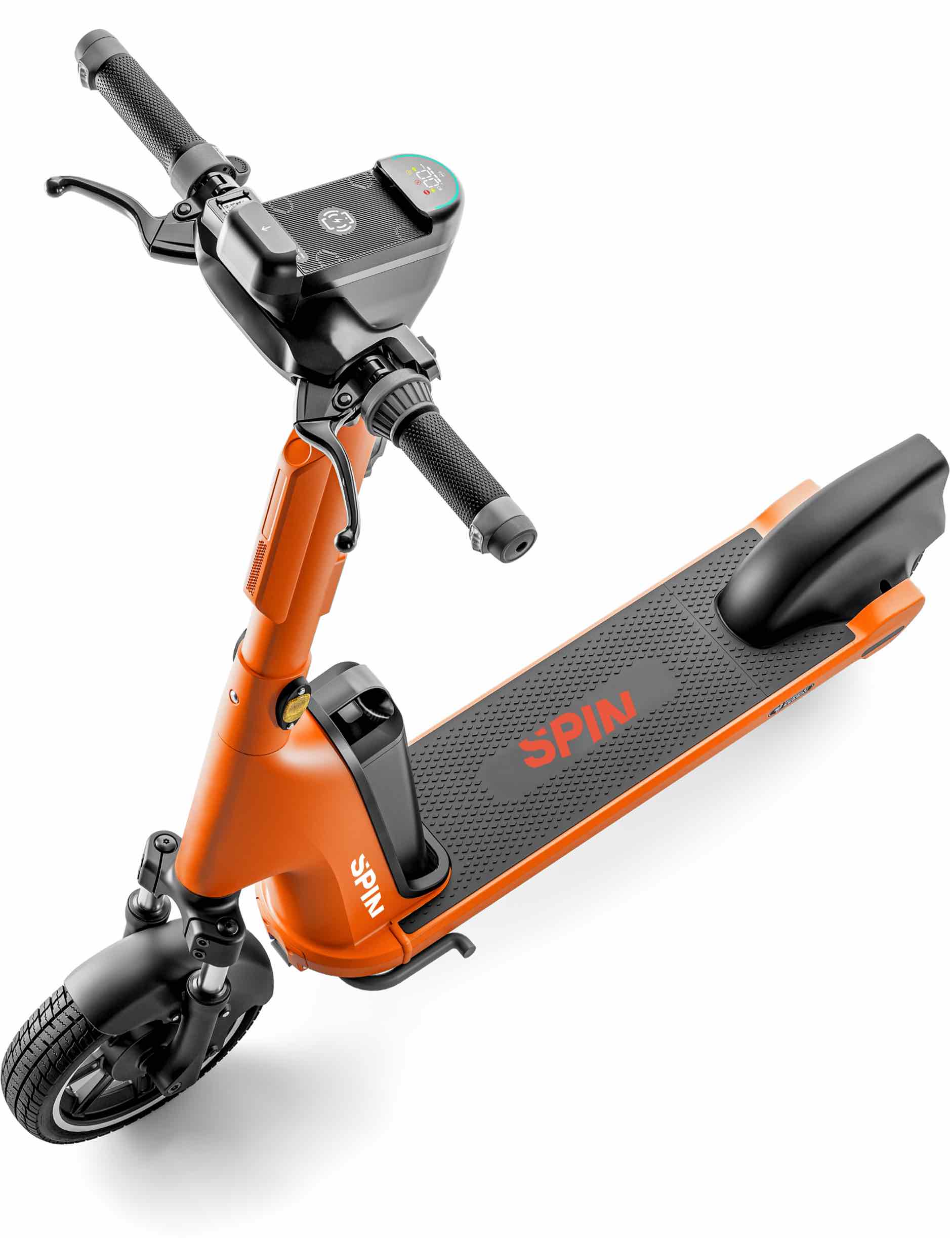


(even when the scooters aren’t)
.jpg)