
We were brought in to refine an existing Webflow website—not rebuild it from scratch—finding opportunities to improve clarity, usability, and tone while respecting the foundation already in place. The result is a modern, approachable site that feels intentional, grounded, and easy to navigate.

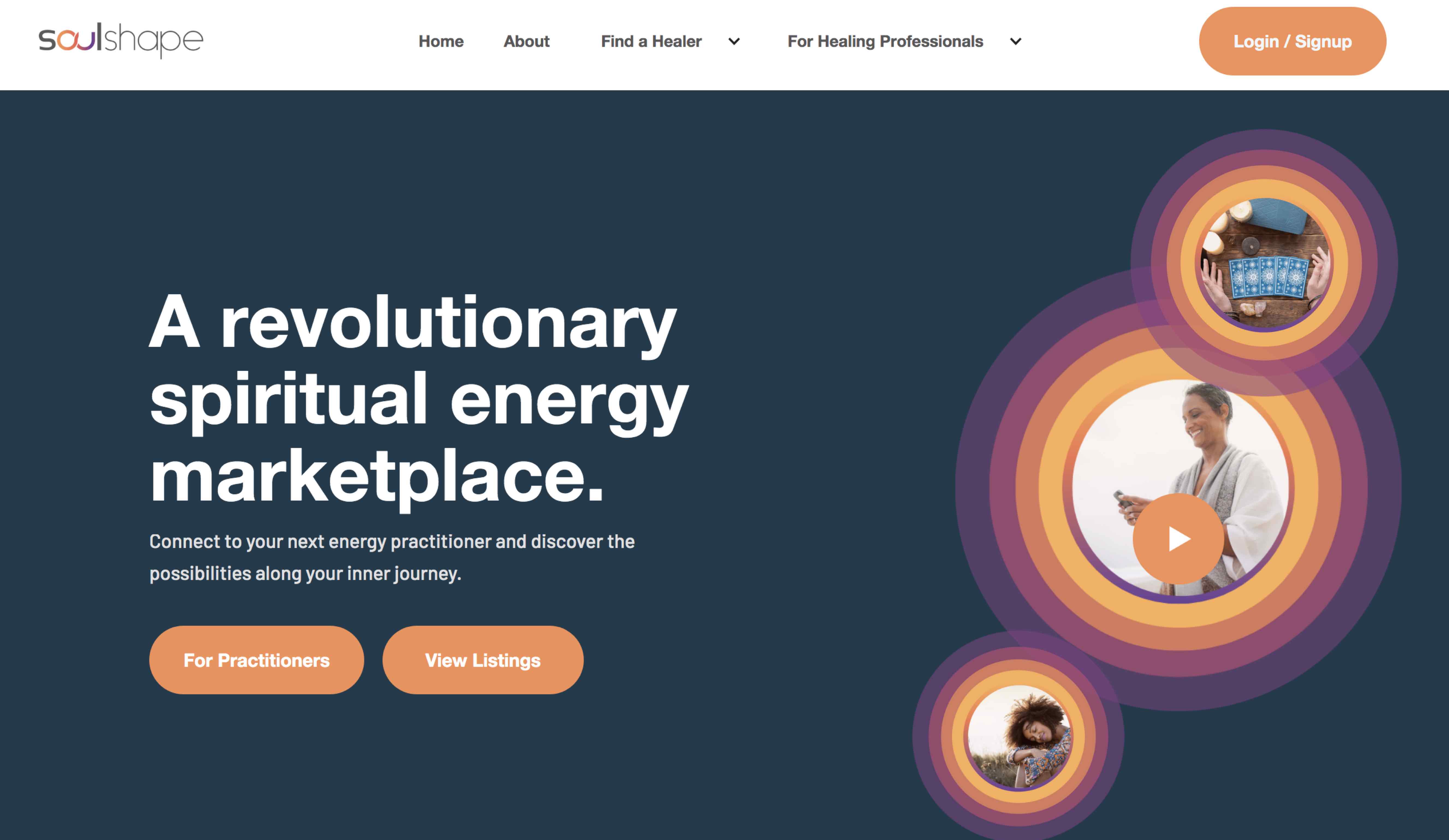


Messaging overlapped, navigation felt unclear, and the overall experience lacked the sense of calm and trust you’d expect from a health-focused platform. The challenge wasn’t to reinvent SoulShape, but to gently untangle it.

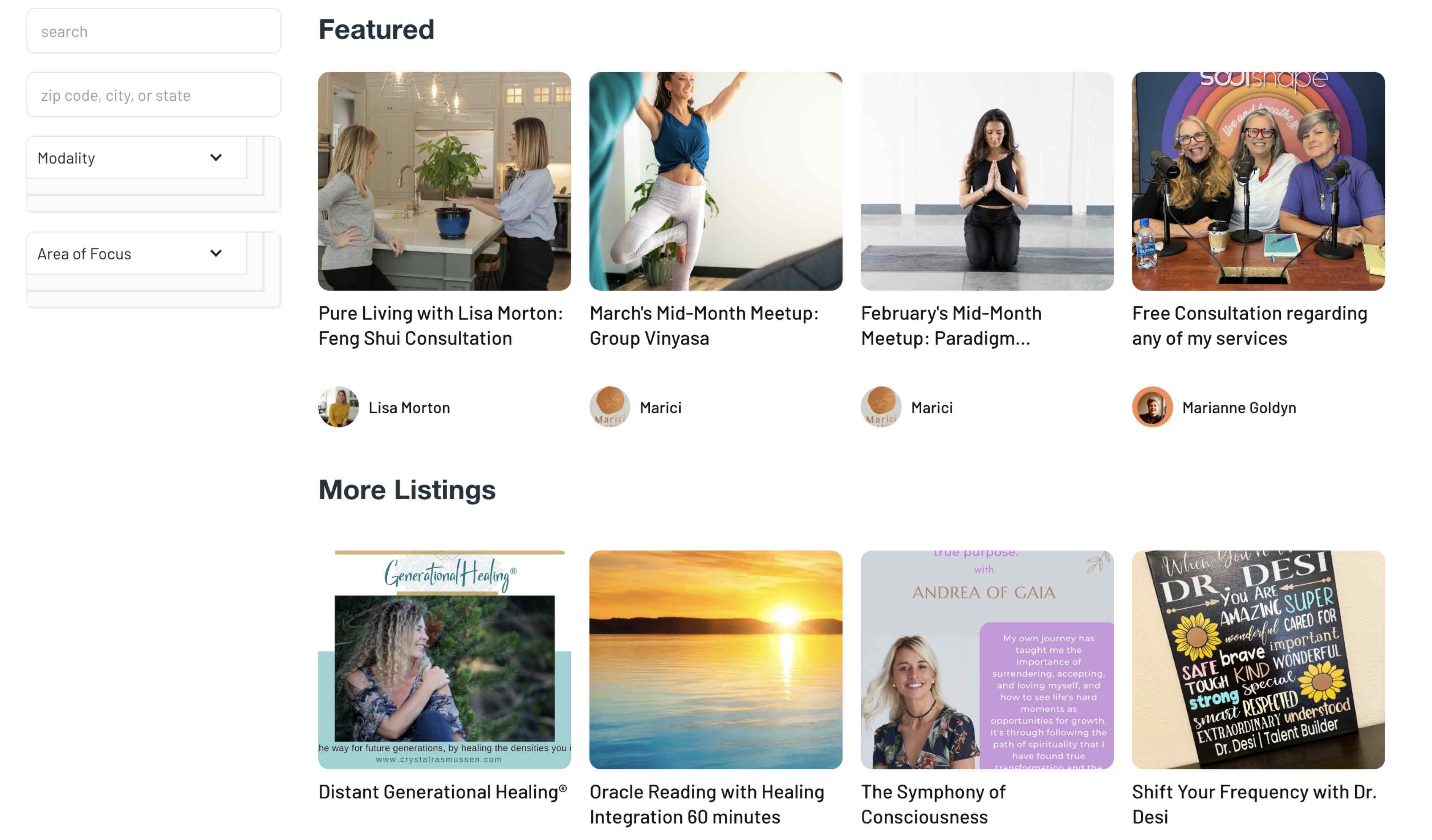
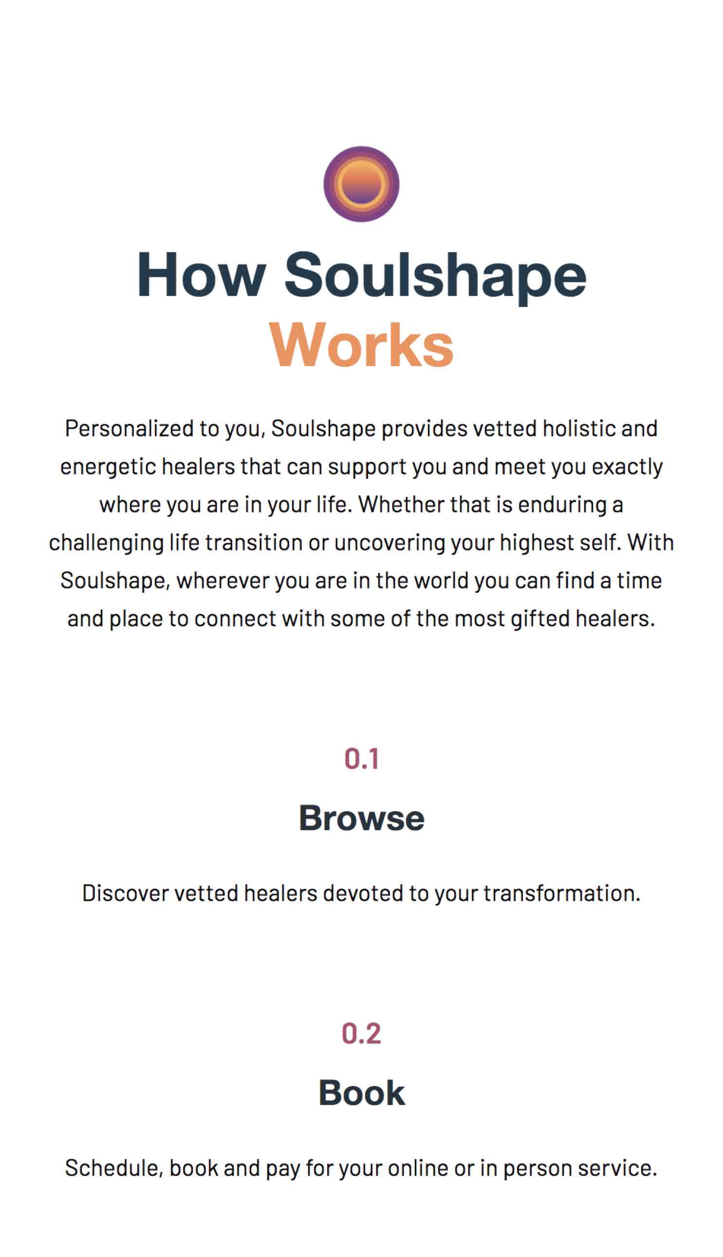
Visual hierarchy was simplified, whitespace was used more intentionally, and content was reorganized to reduce cognitive load. Every decision was guided by one goal: make the site feel as calming and supportive as the connections SoulShape helps facilitate.


.jpg)
